Mastering Layout Design: The Key to Creating Engaging Web Experiences
Tuesday, September 10, 2024
Creating a layout that captures the user's attention while delivering a clear message is crucial in web design. A well-structured layout enhances aesthetics and improves usability, guiding users through content seamlessly. To achieve this, you must master several core layout design principles: defining the grid, designing the message, establishing a focal point, and using a modular grid system. In this blog post, we’ll break down each of these elements with examples, helping you build visually compelling and user-friendly web pages.
1. Define the Grid
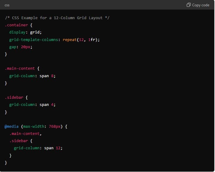
A grid is the backbone of your design layout. It provides a framework that helps organize content, ensuring a consistent and balanced visual structure. Defining the grid early in the design process is essential because it dictates how elements will align and scale across different devices.
Example: Consider the classic 12-column grid, which is commonly used in responsive web design. By using a 12-column grid, you can create flexible layouts that adjust seamlessly from desktop to mobile. For instance, on a desktop view, you might have a layout where the main content spans 8 columns and the sidebar takes up 4 columns. On a mobile view, the grid can collapse so the main content and sidebar stack vertically, both taking up the full width of the screen.

2. Design the Message
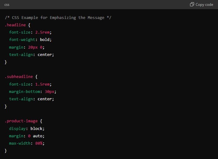
Every web page communicates a message, whether it’s selling a product, sharing a story, or providing information. Your layout should be designed to convey this message clearly and effectively. Focus on hierarchy, typography, and whitespace to direct the user's attention to the most important content first.
Example: Let’s say you are designing a landing page for a new product launch. The message you want to convey is the product's unique value proposition. Use large, bold typography for the headline, plenty of whitespace around it to make it stand out, and a supporting image or video to visually communicate the product's benefits.


3. Establish a Focal Point
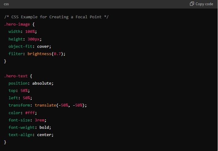
A focal point is the visual element that immediately draws the viewer's attention when they land on a web page. It’s crucial to establish a strong focal point to guide users through the page in a way that aligns with your design goals. The focal point could be a hero image, a call-to-action button, or a featured product.
Example: If you’re designing a blog post, the focal point might be a striking header image or the headline itself. You can create contrast through size, color, or placement to make this element stand out.

By overlaying text on a hero image and using contrasting colors, you direct attention to the most critical content right away.
4. Use a Modular Grid System
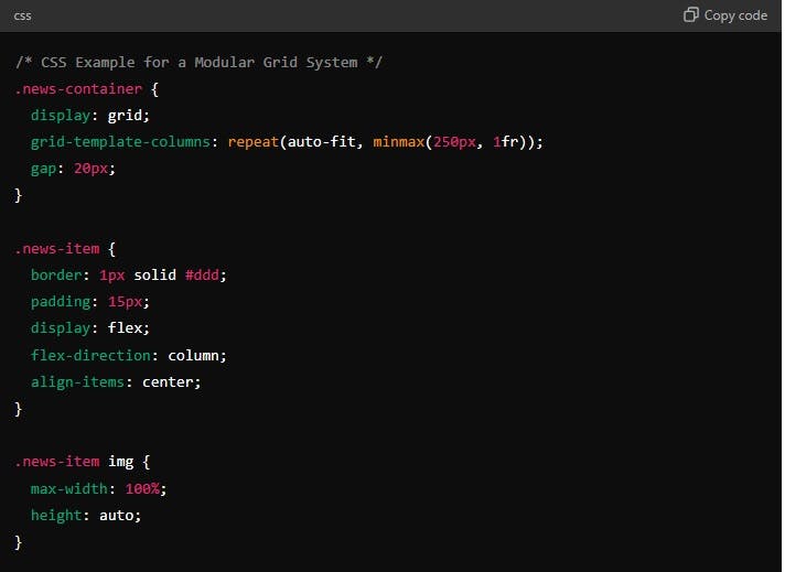
A modular grid system divides your design into smaller, reusable modules or blocks, creating a flexible and adaptable structure. This approach is especially useful for content-heavy sites like news websites, e-commerce platforms, and portfolio pages.
Example: Think of a modular grid as a set of building blocks. For a news website, each block could represent a different article, with its own headline, image, and summary. You can rearrange these blocks on different devices without disrupting the visual harmony.

By using the repeat() and minmax() functions in CSS Grid, you can create a responsive, modular grid that adjusts dynamically to different screen sizes.
Conclusion
Mastering layout design involves more than just placing elements on a page. It’s about defining a grid that supports your design, crafting a clear message, establishing a focal point to capture attention, and using a modular grid system for flexibility and adaptability. By applying these principles, you’ll create layouts that are not only visually appealing but also highly functional, enhancing the overall user experience.
Start implementing these strategies in your next web design project, and watch your layouts come to life in ways that are both engaging and effective!